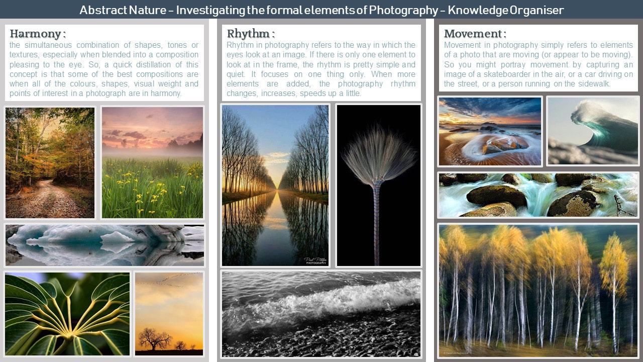
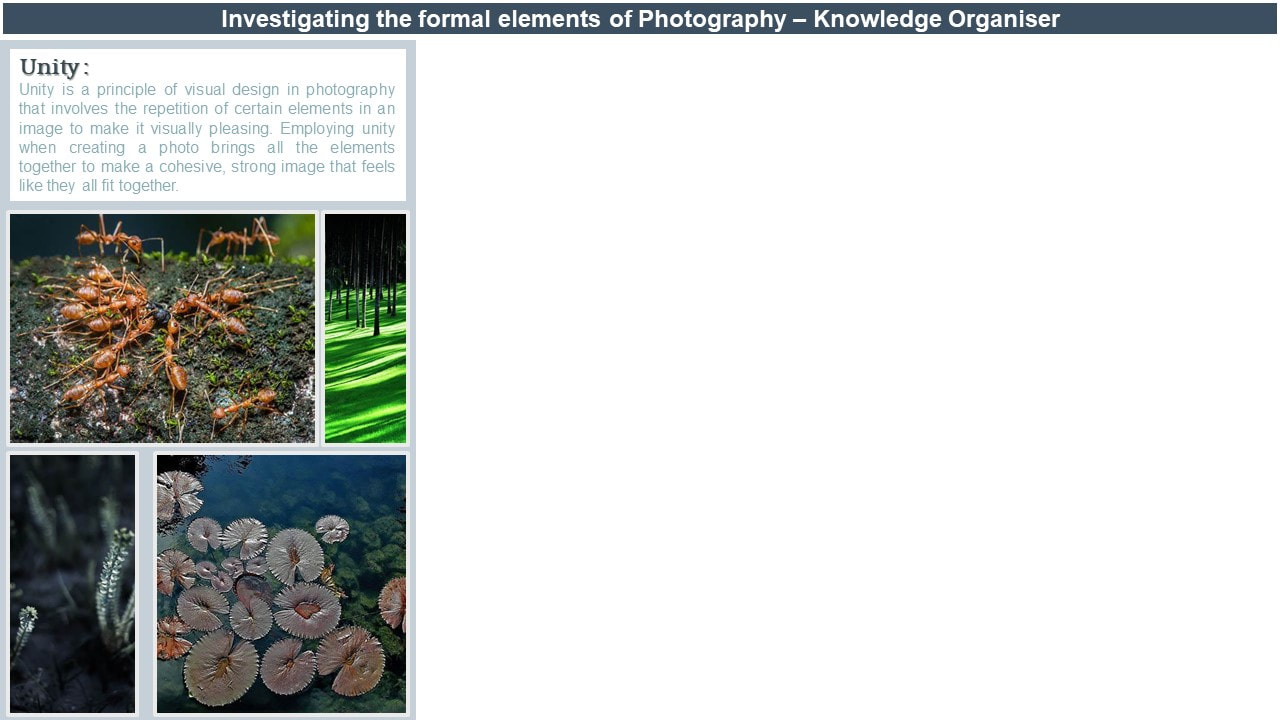
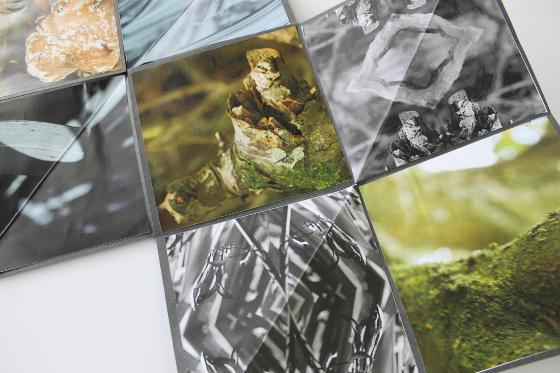
Abstract Nature : personal project

Abstract Nature: What is Abstraction
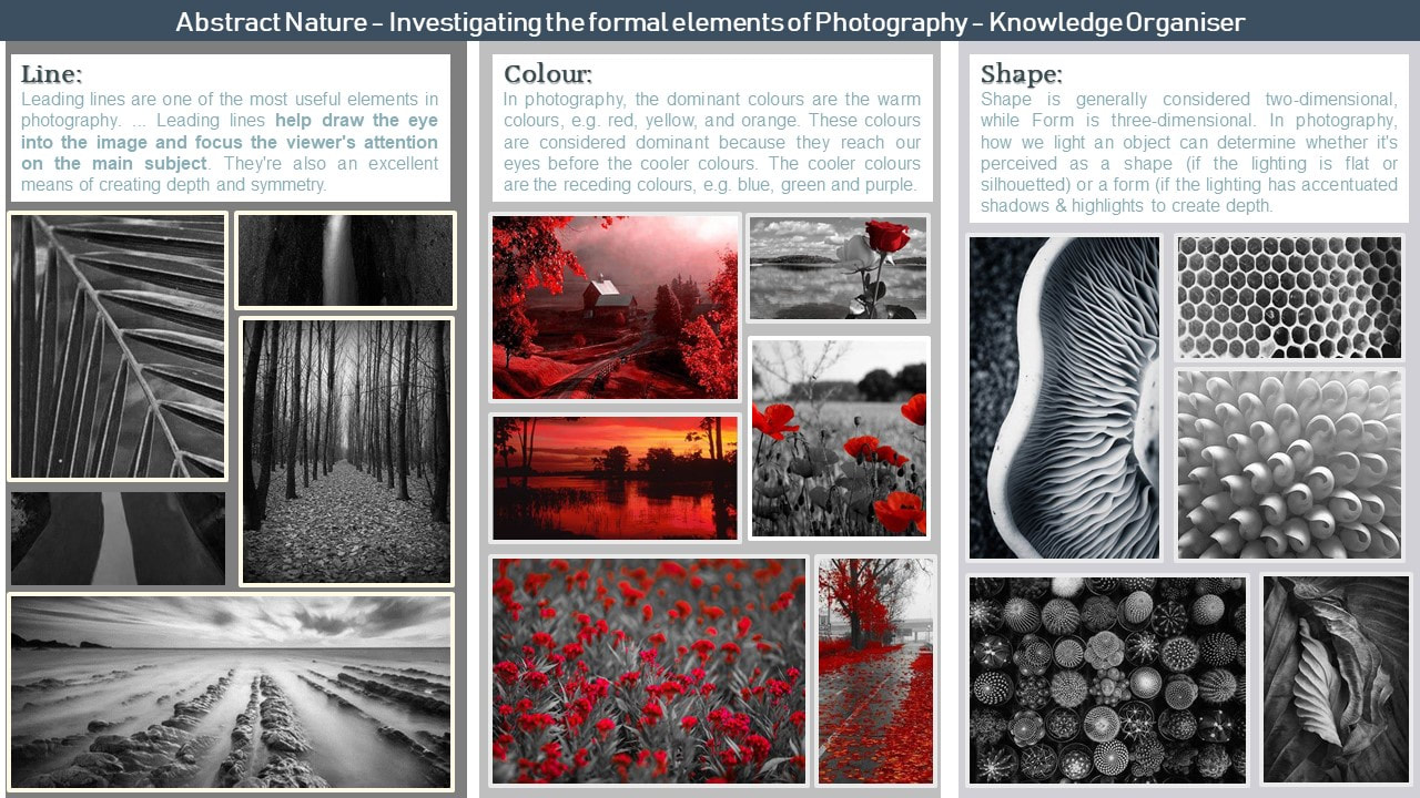
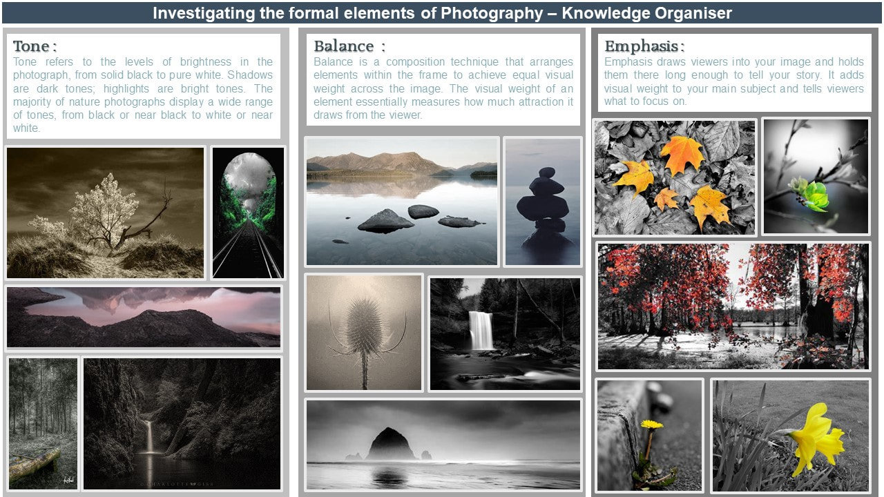
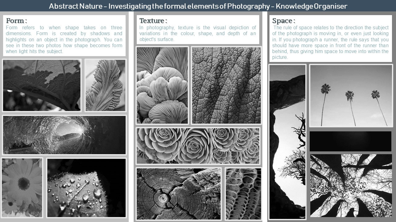
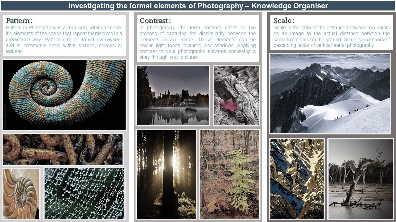
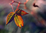
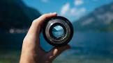
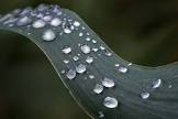
Abstract photography, sometimes called non-objective photography, experimental or conceptual photography, This means you wont know what the visual image is within immediate association with the object that has been created through the use of photographic equipment, processes or materials. Mainly abstract photography focuses on the elements of art and the principals of design. these are known as the formal elements of photography. below are some examples of abstract photography that I am inspired by and some initial research into the formal elements of photography.


Abstract nature: INVESTIGATION OF ABSTRACT PHOTOGRAPHY TECHNIQUES
MONOCHROMATIC PHOTOGRAPHY: shoot / contact sheet.


Monochromatic is used in photography so you can focus on the image and not just the colors. In my shoot is used 1200d DSLR camera from the brand canon. with a 18-55mm lens on it. the weather when i took this was sunny which meant that the lighting in some of my images was over exposed or under exposed it was difficult to try get the exposer right. the vantage points i used were close up and eye level and birds eye view as I found it the best way to get my camera to focus on the object not the background.
My strength of my images was the lighting because it created some nice shadows and with them being in monochromatic you can focus on the shadows more then if they were in color.
My strength of my images was the lighting because it created some nice shadows and with them being in monochromatic you can focus on the shadows more then if they were in color.
|
|
|

|
For my editing process I used pixlr e and the tools i used are cropping and I changed the picture to a cooler temperature with the temperature and tint adjustment. this help me add add a blue tone to it, I also used the exposer tool to help adjust the brightness of my picture as it was over exposed. this picture is darker than the others as it has more shadows than highlights.
|

|
for my editing process I used pixlr e and the tools i used are cropping and I changed the picture to a cooler temperature with the temperature and tint adjustment. this help me add add a blue tone to it, I also used the exposer tool to help adjust the brightness of my picture as it was over exposed. |

|
For my editing process I used pixlr e and the tools i used are cropping and I changed the picture to a cooler temperature with the temperature and tint adjustment. this help me add add a blue tone to it, I also used the exposer tool to help adjust the brightness of my picture as it was over exposed. this is my favorite picture as I found that not much editing was needed to make it look better.
|

|
For my editing process I used pixlr e and the tools i used are cropping and I changed the picture to a cooler temperature with the temperature and tint adjustment. this help me add add a blue tone to it, I also used the exposer tool to help adjust the brightness of my picture as it was over exposed. with this picture i aslo had to use highlights and shadows as i found that there was to many shadows and the picture was quite dark. |
ICM : internecinal camera movement shoot/contact sheet.


|
ICM is were you can move your camera in any direction to get a sort of blurred effect on the images. in my shoot is used 1200d DSLR camera from the brand canon. with a 18-55mm lens on it. the weather when i took this was perfect as this shoot was done inside meaning the lighting was good as well as the weather as there wasn't too much sun or not enough. the vantage points is used were close up and eye level as I found it the best way to get my camera to get my pictures to be clear. My strength of my images were the lighting / exposer the abstract qualities of these photos make them look very blurry but also clear enough to see the object. |

|

|

|
|
For my editing process I used pixlr e and the tools i used are the exposer tool to help adjust the brightness of my picture as it was over exposed. I also used the vibrancy adjustment to make my picture more bright as they were quite dull with the lighting we had inside.
|
For my editing process I used pixlr e and the tools i used are the exposer tool to help adjust the brightness of my picture as it was over exposed. I also used the vibrancy adjustment to make my picture more bright as they were quite dull with the lighting we had inside. this phot has been brightened all the way to make the flowers pop from the paper as this is the picture before or the ICM was used and introduced to the rest of the pictures.
|

For my editing process I used pixlr e and the tools i used are the exposer tool to help adjust the brightness of my picture as it was over exposed. I also used the vibrancy adjustment to make my picture more bright as they were quite dull with the lighting we had inside. i also used the cropping tool for this image as I wanted to focus on the one purple flower.
|

For my editing process I used pixlr e and the tools i used are the exposer tool to help adjust the brightness of my picture as it was over exposed. I also used the vibrancy adjustment to make my picture more bright as they were quite dull with the lighting we had inside. i also added a brighter hue and cooler temperature to this to make the flowers seem more vibrant.
|
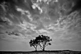
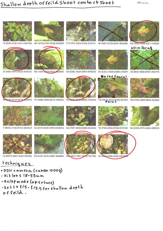
SHALLOW DEPTH OF FEILD: shoot/ contact sheet.


|
Shallow depth of field in photography is achieved by shooting photographs with a low f-number, or f-stop — from 1.4 to about 5.6 — to let in more light. which then makes your camera focus on the object at the front of the image and it blurs the back ground.
in my shoot is used 1200d DSLR camera from the brand canon. with a 18-55mm lens on it. the weather when i took this was windy so it was difficult to make sure the object that i was trying to photograph stayed still or still enough. it was quite sunny when i first stated my shoot then it got quite dark so it effected my shoot as I didn't have the same lighting in all my pictures. the vantage points is used were close up and eye level as I found it the best way to get my camera to focus on the object not the background. My strength of my images were the lighting / exposer the fact that i could turn a tree stomp or a leaf into a shallow depth of field image. with one o9f the images that i took you can see a spider web stretched between two trees. |
|
ARTIST INVESTIGATION / Edward Weston

who is he?
Edward Weston was born March 24, 1886 and is known for his innovative work in photography. during Weston's carer he explored many genres of photography including his most most memorable. still-life, landscapes, portraits and nudes. why the quote?
I choose theses quotes because they tell us the truth with photography and that a camera sees more than the eye does. also with him saying of active bodies and minds we can say that they tell us that people see it differently even cameras. |
“The camera sees more than the eye, so why not make use of it?” “Photography suits the temper of this age – of active bodies and minds. It is a perfect medium for one whose mind is teeming with ideas, imagery, for a prolific worker who would be slowed down by painting or sculpting, for one who sees quickly and acts decisively, accurately." why this artist?
To begin my Abstract Nature Artist Investigations, I will start by studying the work of Edward Weston. He thoroughly explores the genre we are currently studying: abstract nature photography. some of his most eye-catching work comes from this genre of photography. between 1927 and 1930 he took close up photographs of distorted peppers, seashells and halved cabbages. trying to capture there lush textures of the objects. why this video?
I choose this video because it gives us a glimpse of his life and how he processed his work/ photographs. I find it interesting that he never used a digital camera and that the cameras he used created such clear and precise images. |


SEMI ANALYSIS/ EDWARD WESTON
|
SUBJECTS:
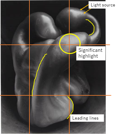
The title of this photograph is 'Pepper No. 30' it was created on August 3rd, 1927 by the photographer Edward Weston. It became one of his most well-known images that he ever took. due to its unusual form, lighting and composition. it also falls into 2 different categories of photography (abstract nature and still life). in this picture Edward has used and unusual green pepper and a tin in which it has been photographed. ELEMENTS:
Edward Weston has used the rule of thirds to create balance in the photograph; at each intersection of lines there is a particular point of interest, this means that although the focal point is not centralised, they are equally distributed across the image plane. The vignette in the background frames the green pepper, which means it is keeping the viewer's eye focused on the form of the pepper and not the foreground. The perspective that Edward Weston has taken the photo from is at eye level. This is effective because it means the viewer is seeing what Edward saw and you can see more of the form and shape of the green pepper. The viewer's eye is led around the image by the various curved leading lines. The unusual form of the pepper in combination with the intentional dramatic lighting,using a low exposure, creates great contrast between the background and the subject ( the pepper). the arced leading lines draw the viewer's eyes away from the centre of the image. this then means that it also leads the viewer's eyes to the significant highlights of the right side of the photograph. Meaning it drags the viewer away from the insignificant background. Edward Weston creates a range of visually pleasing elements in this image. The most striking being shape, value, space and form. the extreme dark and light create a simplified shape by the single tones. Media:
in this image, Some shallow depth of field is used to emphasise the subject more than the background making your eyes look at the pepper rather than the vignette. which enhances the abstractness of the pepper. This is close-up, still-life style photograph that is taken from a short distance. This photo has been taken using a studio, placing the pepper in the opening of a funnel to create dramatic lighting, (artificial) this is because of the six-minute exposure. the lighting helps create the 3 dimensional looking shape rather than a flat 2 dimensional shape. the dark background of the image helps oppose the white and grey tones of the subject, this helps give the image a low-key style. resulting in a dramatic looking image. Weston will have carefully placed his camera to ensure that it wouldn't move and then manually edited his image in his dark room to create his perfect image with all its elements. Intent:
throughout Edwards career he experimented with the concept of abstract nature photography and is now known as a man who pushed the boundaries of photography in very creative ways. He chose the photograph 'normal' objects. that appeared to have no particular visual intrigue, and in doing so changed our perspective of the photographic medium. Despite Weston's expressed aversion to the interpretations of "pepper No. 30" as sexual or having the appearance of nude figures, I believe it is an entirely valid interpretation. The moving form and curvaceous leading lines are reminiscent of the female figure. |

Pepper No. 30 - 1930, Edward Weston
|
Technical Processes / Low Key Photography

|
Low key photography is a genre involving the lowering of camera exposure. The aim of this is to create a much darker background, to highlight detail and information.
Low key photography can create more dramatic and detailed images and it can conceal the light better in certain places. this helps to create shadow. This also works to emphasise the limited lighting only present in specific areas of the image. This also creates dark and light accents on the photograph. |


Shoot plan / Edward Weston

|
This shoot is inspired by the work of Edward Weston, more specifically his monochromatic , low key depictions of vegetables in abstraction, this links to our current theme of abstract nature as the aim of his shoots is to show us how the mundane objects (vegetable) turn into an abstract context. I will be completing this shoot in our weekly photography lesson that we do in school time. doing this shoot indoors can effect my shoot and how much natural light I'm getting in the camera lens. This can effect my shoot because if I don't get enough light in my lens my image will be under exposed.
|
To replicate Edward Weston's work specifically his image 'Pepper No. 30', I will use similar props and I will experiment, placing various vegetable inside of the plant pot. therefore exposing them to the light source at an angle to emphasise the form due to the limited source of light minimising the number of light sources which well then aid me in creating images in a low key style of image I'm trying to recreate. the plant pot will help me recreate the vignette framing the pepper in Weston's work, it will also provide a dark vacuum-like background space. to stop to much light getting into the plant pot i will use a peace of black card where the pots draining holes are to shield it from the light source that I don't want or need. and to stop the camrea from shaking i will use a tripod to hold my camera still.
For this shoot, I will use a DSLR camera, Canon 2000D, and the standard kit lens. I will use manual setting to gain better control over shutter speed, aperture and ISO. I will use a Low ISO setting, mid-large aperture (depending on the amount of light available) and slow shutter speed. To be specific I will use an aperture between f/4 and f/8, an ISO of 400 and a shutter speed of 1/160. to hold my camera still I would ideally like to use a tripod but if in cant find one I will improvise and use a pile of hardback books.
Contact Sheet / Edward Weston


step 1: Firstly I opened up my selected image form the Edward Weston Shoot. I am using PIXLR-E as my chosen editing software.
|

step 2: I adjusted the brightness and contrast to decrease the brightness of image to get the look of using a analog camera.
|

step 3: Next I cropped my image using the rule of thirds. I wanted my image to be slightly off-center to draw attention to the surrounding blank space.
|
step 4: i then edited the back ground to get rid of any little objects the were taking away from the pepper.
|
Final images of Edward Weston.

For my editing process i used pixlr e and for this particular image i used the crop feature to get the best part of the image to be the focal point of the image. I also decreased the exposure so that the image looks darker round the pepper which is the main object in this photograph. the camera I used was a 400D canon
|

For my editing process i used pixlr e as i find this best for editing when it comes to exposure and lighting as it makes the photo look more realistic and clearer. i edited the exposure as i wanted this image to be brighter than the rest. i also increased the saturation and cropped my image to get the pepper to be the focal point. the camera I used was a 400D canon
|

The strengths in this image are the shadows and contrast of this onion. I didn't have to do much editing as I like this image how it was and the contrast of this image was how I needed/ wanted it.
When post-processing, I used PIXLR to adjust. I find this editing website the best when editing the exposure and contrast of photographs. For this particular image I didn't have to do much editing but I did have to crop the image as well as darken the exposure slightly. This image got taken with a 400D cannon camera with a wide lens on. |

For my editing process i used pixlr e and for this particular image i used the crop feature to get the best part of the image to be the focal point of the image. I also decreased the exposure so that the image looks darker round the pepper which is the main object in this photograph. i also had to blur the background so you couldn't see the shadow of the pepper that the light we used created as it would have stopped the image from looking like Edward Weston work. the camera I used was a 400D canon
|
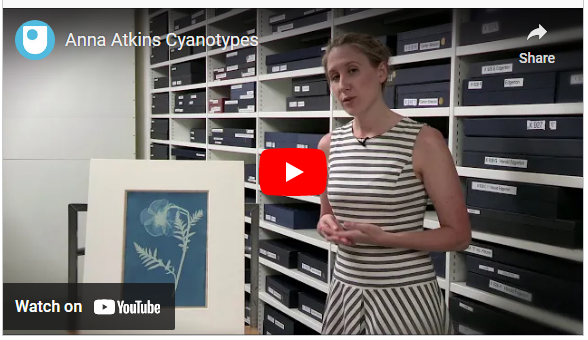
Abstraction through cyanotypes / Anna Atkins
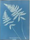
My three favorite anna Atkins cyanotypes
|
who is anna Atkins?
Anna Atkins was an English photographer and botanist noted for her early use of photography using cyanotypes. she is know for being one of the first female photographers which wasn't very common in her time period. The process was discovered by the scientist and astronomer Sir John Herschel in 1842. A few advantages of using cyanotypes is that it is safe to do as no harmful chemicals are used. they are cheap to produce as you don't need a dark room to produce/ develop them. lastly its a high contrast print. Advantages and disadvantages of cyanotypes
A few advantages of using cyanotypes is that it is safe to do as no harmful chemicals are used. they are cheap to produce as you don't need a dark room to produce/ develop them. lastly its a high contrast print. a few disadvantages are that they are not guaranteed to work as they are very weather dependent as they need a lot of sun light to develop. |


What are cyanotypes?
The cyanotype is a photographic printing process that produces blue prints using coated paper and light. The process was discovered by the scientist and astronomer Sir John Herschel in 1842. Herschel used the cyanotype process so that he could reproduce mathematical tables along with other notes and diagrams.
The cyanotype is a photographic printing process that produces blue prints using coated paper and light. The process was discovered by the scientist and astronomer Sir John Herschel in 1842. Herschel used the cyanotype process so that he could reproduce mathematical tables along with other notes and diagrams.
|
Modern cyanotypes
Today, many cyanotype artists still make photograms, as Atkins did, by Others, like Angolan-born, Milan-based artist Délio Jasse, or German artist Ulf Saupe, create film negatives that they place on the paper before exposing it. This image is an example of the use of modern cyanotypes.
Brenton, a master of the 1840s cyanotype process, chooses this antique medium to render his one-of-a-kind dreamlike visions in an equally unique and intense hue, mirroring the ocean outside his studio window and the blue-black depths of the night sky in Maine. I’ve still never seen another cyanotype that colour. This image is an example of the use of modern cyanotypes.
Barbara Hazen is a 3rd generation Californian. Her work explores the internal self and the intersection of memory and the family scrapbook, with an emphasis on cyanotype and platinum palladium processes. |


|

|
Cyanotypes evaluation:
To create our cyanotypes, we began by preparing some water color paper which was coated in a solution of iron salts. We used the water color paper as it absorbed the solutions better which meant that the final image color was bolder, creating greater contrast between the imprint and the background. Then we got a piece of fabric and did the same process onto that. Finally, we created a positive of our favorite image from our Edward Weston shoots. We then did a invert of it to create a negative on acetate. To achieve our negative, we went onto Pixlr and made it into an invert. This meant that the light will now be dark and the dark will become lighter. Personally, I believe that the fabric cyanotype was my most successful as you could really see the detail within the leaf and the fabric gave it more texture to the final outcome. If I could have another lesson on this topic, I would focus more on picking better leaf's to put onto my cyanotypes to create a better final outcome. I believe this would make it all come together more and make it look nicer. |
Abstraction through photograms / Man Ray

What are the advantages/disadvantages of photograms?
When creating a photogram you have much more control over the design of your image. This process is also a good way to create abstract images as the contrast of the bright white create abstract images as the contrast of the bright white impression and black exposed background, make the object stand out distinctly. This also give the picture the look of being inverted. |
Who was Man Ray?
Man Rays original name is Emmanuel Radnitzky he was born August 27, 1890. He is a famous 20th Century artist, He worked with a range of mediums and considered himself predominantly as a painter. However he is best known for his photographic works, he is also celebrated for his work with photograms which are also know as Rayogrammes. he often used light and shadow in his work. What are photograms?
A photogram is a photographic image made without a camera by placing objects directly onto the surface of a light-sensitive material such as photographic paper and then exposing it to light. However if light is able to permeate a translucent part of the object or reach under its surface it will change in tone. If there is no protection at all the paper will turn black. |

|

|

|
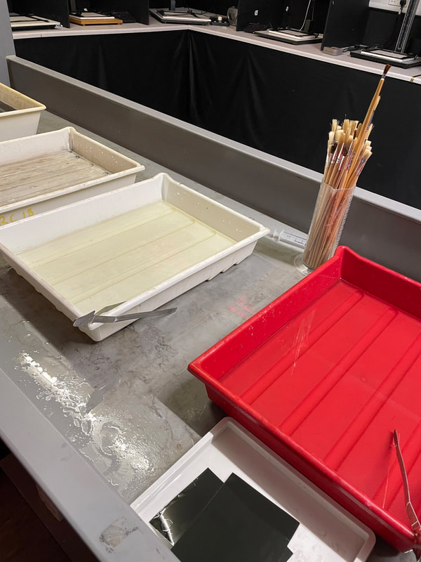
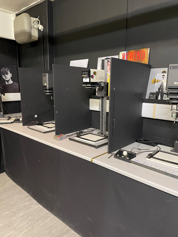
College Visit / Dark Room Workshop

|
These are some photograms I produced during a dark room workshop. I really enjoyed the process of creating photos without a digital camera, and found the artistic experimentation with the chemicals -physically editing the background's development- especially enjoyable.
Above are some images of the direct chemical trays and paintbrushes used to created the drip and stripped backgrounds in three of my images. The other photo depicts the enlargers. |
Horst P. Horst / The unfamiliar and abstracted
Fashion photographer Horst P. Horst used rotational symmetry to create new patterns. His book, Patterns from Nature (1946), has inspired me to create my own series of rotational symmetry patterns using my work so far. Here are some of my examples:


Technical Processes / High Key
|
Recommended setting from video.
|
High Key Photography is a term to describe images that are bright and contain little to no shadow. It is also sometimes used to the photographic style that is simply bright, often with an overexposed background.
|


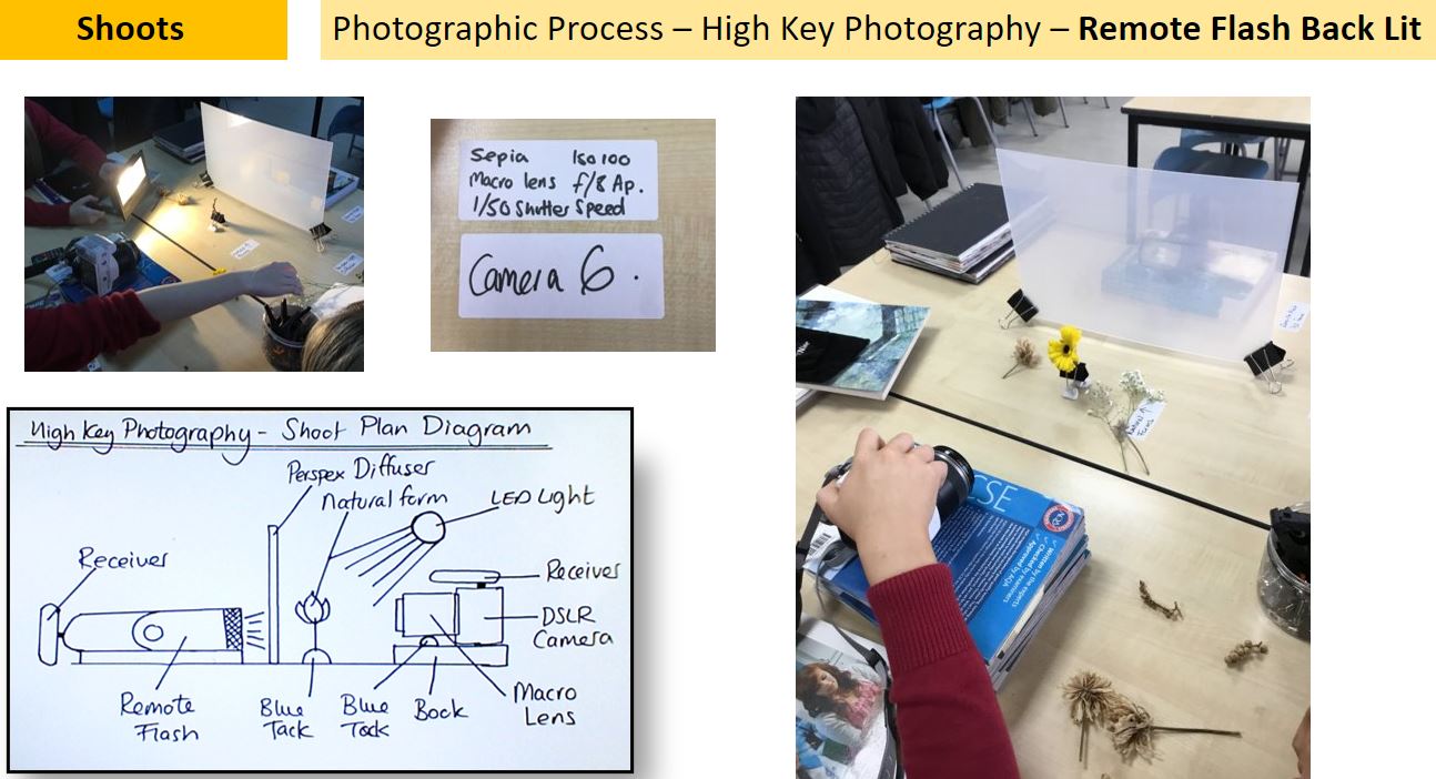
Equipment used.


High Key Photography- Shoot Plan Diagram

|

|
Shoot Plan / Karl Blossfeldt
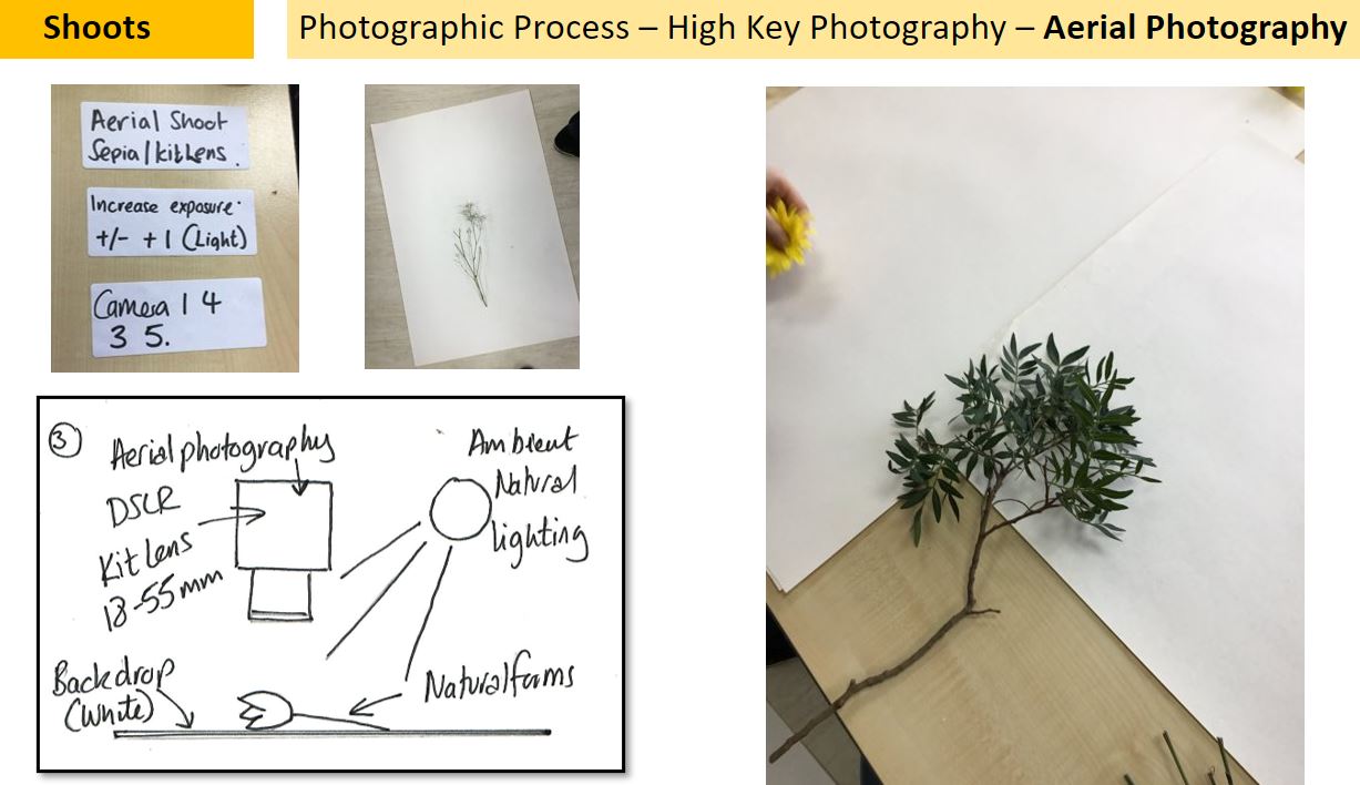
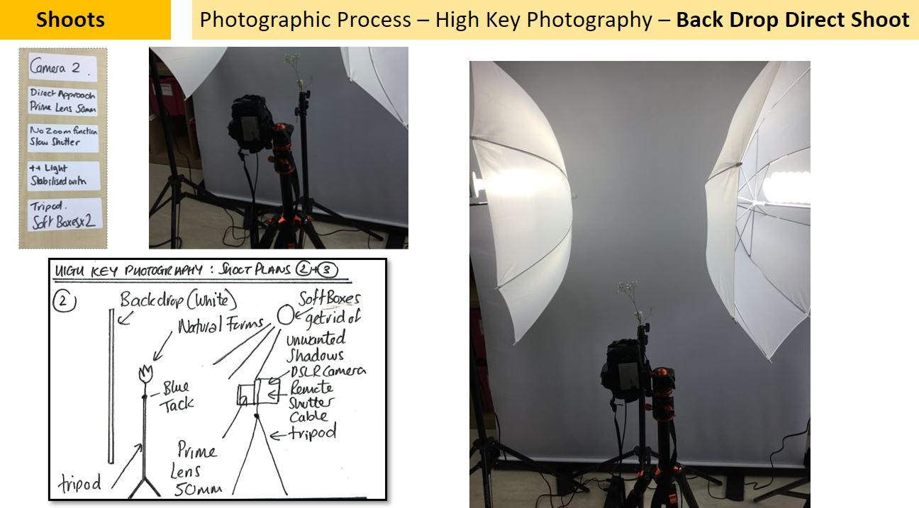
I have taken inspiration from the photographer Karl Blossfeldt as I have been studying the way he creates abstract forms from nature and I was very keen to try recreate these images. The shoot will take place in the classroom as I can control the lighting and not have to worry about how the natural light would effect the images I am trying to recreate. the props used will be natural forms such as seed heads and shells because these were commonly seen in Blossfeldts work and provide good amounts of texture, light and form . I will also use a white backdrop in all shoots. I will shoot in High-Key for my images using a combination of soft boxes, remote flashes, Perspex diffusers and natural ambient light. I will need to control the lighting to avoid shadows and distance my subject matter away from the backdrop.
|
|
|
Artist investigation / Karl Blossfeldt
Nature educates us into beauty and inwardness and is a source of the most noble pleasure. The plant never lapses into mere arid functionalism; it fashions and shapes according to logic and suitability, and with its primeval force compels everything to attain the highest artistic form. |
Why this artist?
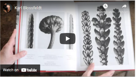
I have previously studied the work of Anna Atkins and Horst P Horst and Karl Blossfeldt has also similarly studied abstract nature. Who is he? Karl Blossfeldt was a German photographer, born 1865. before he died in 1932. He worked closely with botanical studies, however he began his career as a sculptor and during his life was primarily known for this. Why these quotes? I chose these inspirational quotes because it sums up the work of Blossfeldt because he finds beauty in nature and finds a way to express his love for the simple things in life. Why this video?
I chose this video because I think that it clearly shows and explains Karl Blossfeldts photography. this video gives you a look into his full work to do with still lifer aswell and the annotations to go with. |
SEMI Analysis / Karl Blossfeldt
|
Subject:
Blossfeldt's work primarily features botanical subjects which are photographed against a plain white or cream background (which enhances the subjects form and structure). His work fits into the genre of still life, however some may say that it could also fit into the genre of abstraction because of the contrast between the subject of the image and the background. Elements: Karl Blossfeldt consistently uses space in his photography, although the colour, tone and clarity of his backgrounds vary, the style of minimalistic backgrounds persists in his work. These are free of visual interest, drawing focus towards the subject matter at hand. This simplification allows the viewer's focus to remain on the subject matter, furthermore, contrast between the lights and darks of the background and subject create balance again striking the viewer. His images vary displaying both dynamic and are restful compositions. Although the colours, space in the background and direct approach of the camera show simplification- restful composition. His macro skills and high depth of field mean the images retain a dynamic quality. His work also focuses heavily on form, relying on intrigue being created by the dynamic subject matter he photographs. He creates visual intrigue and satisfaction by frequently using symmetry and the rule of thirds to maintain balance in his images. Balance is also maintained throughout the ever contrasting tones of the subject matter and background. Later in his career he also ventured into use of pattern in creating balance. Media: not much is known about the exacts of the equipment Blossfeldt used; He created his own cameras and utilised some sort of magnification technique to achieve the macro detail present across all his work. His career predates the invention of the digital camera, this is why his work is monochromatic and often features sepia tones. He may have used cropping to aid his compositions: using rule of thirds and centralisation. The high key style lighting, allows more focus to be placed on shape and line, perfect for use as a drawing reference. Blossfeldt never looked too far when choosing his subjects, he never bought his subject matter generally using specimens found in his garden. This adds to the unearthly juxtaposition between familiarity, tainted by intense magnification. Intent: Blossfeldt's use of enlargement means his subjects gain an unearthly quality, this in turn with the sepia, smoky and old-worldly tones of his images provide a sense of industrialism and architecture. This is especially exemplified in the almost unambiguous and stark form of the specimens. The unique approach Blossfeldt takes in his use of macro photography is arguably the reason why he has retained significance, so many decades after his death: due to the unearthly quality they attain. He does not photograph specially selected objects but merely objects of nature easily accessible to him. The unique ode to the past he creates in contrast with the futurist quality the botanical subjects gain is simply due to his style of magnification, as it means the objects are not like anything we would see in our everyday. As his career spanned both the late 19th century and early 20th century, we can really see a mixture of influences coming from differing art eras, and schools of aesthetic. In his work Blossfeldt aimed to showcase the beauty of nature- this is typical of the 19th century enlightenment movement: focussed on appreciating beauty and reading into the meanings of the metaphysical in nature. However his approach to composition displays much more 20th century modernism- influences coming from abstract and surrealist movements. |

Saxifraga Wilkommiana


|
Karl Blossfeldts work


|


|


|


|


|
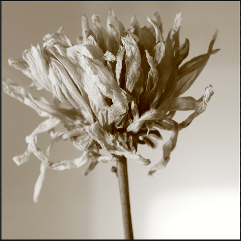
9 best images


Editing process.

This is the image before editing
|

step 1. I cropped the image.
|
step 2. I increased the brightness of the image to make the flower stand out more.
|
step 3. increases the highlights and shadows to make the flower more vibrant.
|

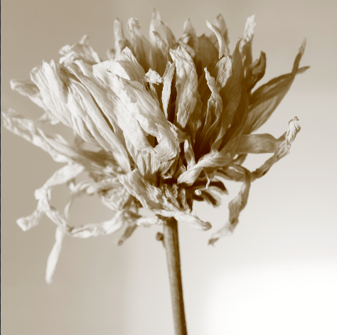
step 4. i then made my image monochromatic.
|
final image
|
contact sheet

|

|
Explosion sketch book

|

|
Artist investigation / Dennis Wojtkiewicz

|
Email Quote – Direct Artist Response
I use a Canon EOS 90D camera with a Canon EF 100mm f/2.8 Macro USM fixed lens. The only reason I even know about the technology is because my colleague told me that's what I needed and would be the biggest bang for the buck. The rest of it is all by feel. I have absolutely no photo training. For me that suffices because I'm not hung up on technical stuff. Just looking for ways to capture information for my paintings. Dennis Wojtkiewicz / January 2021 |


|
Why this artist?
The final artist in the Abstract Nature project is Dennis Wojtkiewicz. This artist differs from my other artists because he takes photos of the objects and then recreates them using oil pastel drawings. However, there are similarities in his use of … Who is he/she? Dennis Wojtkiewicz was born in 1956 and is most famously known for his oil pastel drawing's His website is: www.wojtkiewiczart.com Why the quote? The quote is from a direct email response from Dennis Wojtkiewicz From the email, I was able to gain an incite into his photographic processes, when approaching making a reference image. I can now better emulate his work by innkeeping with his techniques and processes: using a large aperture (f/2.8) and Macro USM fixed lens. Why this video? This video is inspirational to me because it showcases the artist's use of intensified chroma and saturation to elevate the detail and create dynamism in the range of hues and tones. This is something I would like to replicate in the editing of my own images inspired by Wojkievicz's work. I want to replicate the rich detail and high saturation of the harmonious hues of the fruit. I also take inspiration form his use of complimentary hues in the background, allowing for balance in the paintings. |


Photographic techniques / back lighting fruit

|
what is back lighting?
In lighting design, backlighting is the process of illuminating the subject from the back. In other words, the lighting instrument and the viewer face each other, with the subject in between. This creates a glowing effect on the edges of the subject, while other areas are darker. What are the benefits of back lighting: Backlight photography emphasizes the depth behind the subject and gives images a greater sense of place. Dramatic effect. Backlighting can produce a dramatic contrast between the subject and the background. |
the equipment you will need is:


Step 1: using a sharp knife carefully cut your fruit into the needed size segments.
|

Step 2: set up your Perspex glass sheet between two stable objects.
|

Step 3: set you camera to the correct settings.
|

Step 4: test out different ways to get the best picture.
|
Shoot Plan / Dennis Wojtkiewicz
This shoot has been inspired by the paintings of Dennis Wojtkiewicz, he uses backlighting to create his image and his main feature of his photographs is colour. Using the back lighting techniques I will try and emulate his work. I will do this shoot indoors, this will give me better control over the lighting within my images. By using the natural lighting within the room, the ambient lighting will be a big part of y image however the may light source will come from an artificial light under a glass table/ glass sheet laid out across two chairs to keep it stable. The fruit slice I previously cut will be placed on the transparent surface, this will allow the light to pass through and illuminate the finer details of the subject. During my shoot, I will a range of fruits such as kiwis, strawberries, lemon, line and oranges. For the shoot to be done accurately, it is essential that all the fruit slices are cut extremely thin, this is to ensure that the light will pass through them to get the same effect as Wojtkiewicz images do. For this shoot, I will use my DSLR Canon 400D camera with a reverse ring to capture some photos in extreme macro detail. To eliminate camera I will use a tripod with a release cable. The camera setting i will use is f/8-f/12; low ISO for better image quality; slow shutter speed to ensure a lot of light is passed through ; a two second timer to stop all camera movement and finally in the extreme macro/reverse ring element of the shoot, will have a longer 4-5 second timer as avoiding camera shake is essential to capture any clear details.

Contact Sheet / Dennis Wojtkiewicz
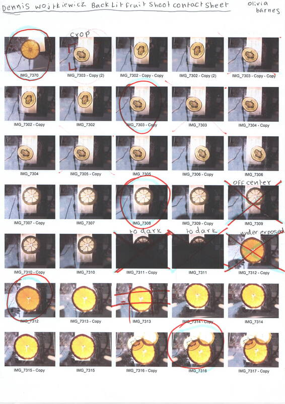
|
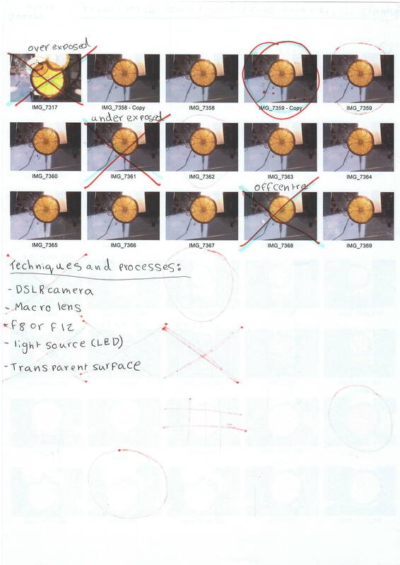
|
Editing process / Dennis Wojtkiewicz

Editing step 1: In this clip, I used the adjustment tool to enhance the colour, saturation and contrast within my image. This help me as I was able to amend my exposure and bring the finer details out of my image.
|

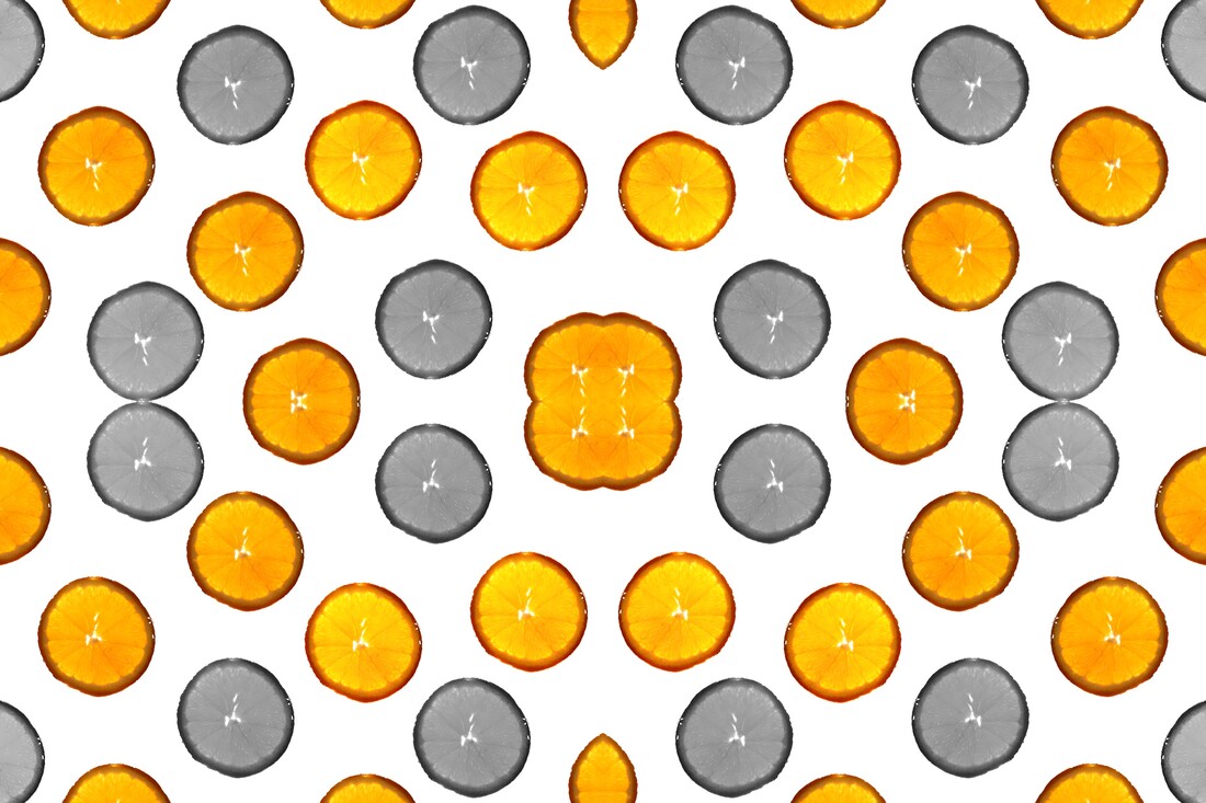
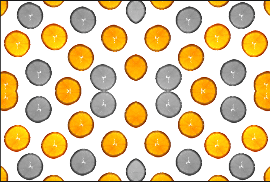
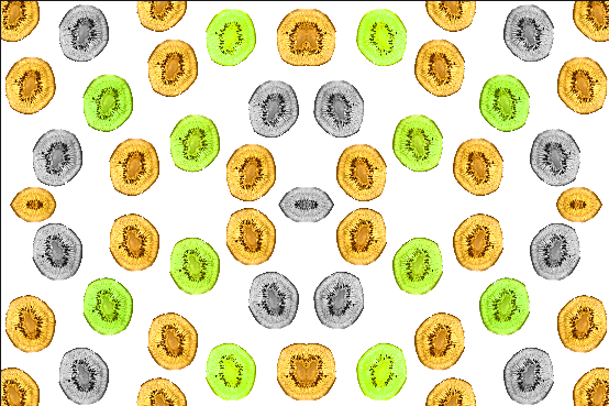
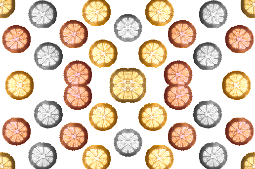
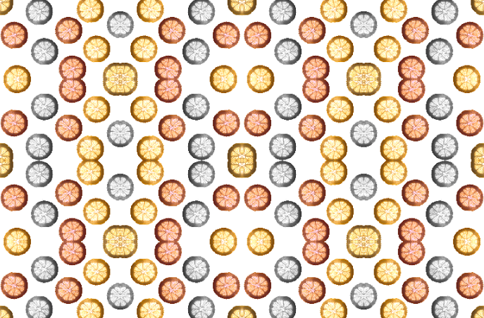
Editing step 2: Within this screenshot, I used the lasso select tool to draw around my image. This made sure I was able to cut of any of my image I didn't want in my final result like the background. I then filled it in with the solid white colour leaving me with just my image in the centre.
|

Editing step 3: Using Pixlr E, I duplicated my image and began to position my image all over the image to create this look. Throughout this, I decided to rotate some of my images so they all looked slightly different throughout and some of the stood out more than others.
|

Edititng step 4: Finally, I adjusted some of the fruits colour by using the auto pop, auto B&W tool, darkened a few of then and then left the rest. This made the fruit all look different.
|
final image\ edit

|
|


|

|


|
|


collage process-year 10 MOCK EXAM


Abstract Nature / Final Evaluation
During this project I have developed my understanding of abstract photography by exploring and experimenting with the theme of nature. before exploring the theme of abstract nature I had little knowledge and experience with the use of digital editing and all the different photographic techniques. the main skills that I have learnt are: using different compositions, the importance of exposure, photography in the absence of a camera for example cyanotypes and photograms, high and low key photography. Throughout the course so far on this project I have furthered my knowledge and understanding of Abstract photography especially exploring the theme of nature. i have looked at many different artists which i am going to explain in this evaluation.
Initially I analyzed the work of Edward Weston, being particularly inspired by his masterful use of composition and employment of the low-key and still-life genres. He does monochromatic photography, experimenting with different styles such as low-key photography. I was inspired by his work because he takes every day objects and looks past the fact it is a normal object, he brings a new light to the object and portrays the way he sees the world through his photographs. He has taken many amazing photographs and was labelled as "one of the most innovative and influential American photographers This shows how he has influenced peoples perspectives on ordinary items, that if you look past the initial object, it can be much more. Through studying this artist, I was able to explore concepts of texture, shape and tone in my own photography examples. This inspired my Edward Weston shoot which was an attempt to emulate his work. Inspired by their work, I created a series of emulations by putting food such as peppers and lettuce in a plant pot and covering the holes. This created the effect of low-key photography which is an underexposed image.
The second artist I explored was Anna Atkins, a 19th century photographer and botanist. Her work using cyanotypes linked well with our topic, Atkins work was inspirational as it developed my understanding of Abstract Nature further. By researching her, I understood that not all variants of photography use a camera, as Anna Atkins used cyanotypes. Whilst studying this artist i was able to explore concepts of line, shape and color in my own photography examples. Inspired by Atkins work, i created a series of emulations by lightly coating watercolor paper, wood and fabric with the solution. After a few days we were ready to lay out my natural forms and then later i left them under a UV lamp to expose. Anna Atkins work helped me understand that cameras can't be the only way of taking photographs and that there are many ways that i never thought of to make photographs.
we then went on to research and investigation the work of Horst P. Horst. This inspired to me because he digitally edited his work to create rotational symmetry. I emulated his work by taking some photographs and editing them on Pixel E. This was very interesting to me as I was experimenting with editing digitally, which is something I hadn't previously looked into. This helped me learn more about abstract nature as it was showing that you can change your images in any way you want to make the picture how you want it. You can edit images as much as you want and rotate them and it will still look good. His work focuses mainly on shape, tone and texture.
I then went on to research the photographer Karl Blossfeldt. Karl has also studied abstract nature and he mainly works with sepia tones. His work inspired me as it showed me the use of space and texture. He is known for his photography of close-up plants and living things. Inspired by his work, I emulated his work with sea life and plants. This reveals the use of space and rule of thirds as he puts one thing in the frame and shows it close up. This highlights the texture in the image and the natural forms. Their work helped me understand the theme of abstract nature by helping me understand balance and how things can be so simple yet effective and eye catching.
The Final artist I looked at was Dennis Wojtkiewicz. I was inspired by the incredible hues and implications of back lighting in his hyper-realistic paintings. Looking at his work gave me the opportunity to explore back lighting in order to highlight intricate detail and texture within a semi-translucent subject. I was also able to explore color saturation and emphasis in my final outcomes from this shoot. I followed a more detailed approach digital editing processes for this shoot as I had to remove the background of the images using the magnetic lasso tool, as well as experiment with different saturation, hue/tint and levels. In my final composition I used emphasis by repeating layers of the edited fruit and leaving some in monochrome tone to enhance the two highly saturated hues. I aimed to either contrast the color of the original fruit or bring out an undertone in the fruit again further emphasizing and adding to the impact of the vivid colors in the final edit. During this shoot I also looked at macro photography as Wojtkiewicz work utilizes intense detail and texture.
i think that my strongest point so far in this course was my final project of abstract nature which was when I did my shoot and the editing of my images inspired by Dennis Wojtkiewicz. This was my best shoot as it was colorful and showed close up images which highlighted texture and editing really appealed to me. This was also a great shoot to edit and after doing some editing, this looked the way I had hoped it would and ended up with some successful end results. This is still far from perfect but I can see my improvements throughout the course . I hope I can continue to learn more and improve further in the near future. I think I can improve by adding more detail and further analyzing my photography's.
